Pages

Friday, June 29, 2012

Why I've Been so MIA (Renegade Craft Fair!)

((I apologize ahead of time for my ghetto fab photos. I didn't get a chance to take my Renegade ones off of my good camera yet, but hey thats just another blog post to look forward to…right? Right.))


holy cow what an amazeballs weekend.

I have been so MIA lately, and you can blame it on my weekend. Not that I'm complaining, cause if I could I would so Renegade Craft all day erry day.

For those not familiar with Renegade Craft Fair it's not just any "craft fair". There are no little cute grannies making lawn ornaments or doilies. It's a traveling indie craft fair that hits up major cities along the US (Brooklyn, San Diego, LA, Chicago and Austin) I was lucky enough to attend the Brooklyn one this past weekend. There were 300 vendors and you have to apply and be accepted in order to be a part of this fair. I am NOT saying this to be all like "yeah buddy home gurl is da bomb diggity" I'm saying this so you can get how epic this fair is.

I'm going to be sharing tips and tricks on how to prep for a craft fair on this lil lady's blog in a few weeks, so for now I'm just going to tell you about my experience with Renegade.

Holy. Frekkin. Cow.

I absolutely LOVED it. You know what else I love? Lists. So now in no particular order here are some highlights from the event:

• I was frekkin PETRIFIED at first. I would say about 85% of the vendors there have either done craft fairs before or are old Renegade Veterans and knew exactly what to expect. I had no idea what to expect since I have never never EVER sold my goods face to face before. The first half hour was super super weird. People would walk into my booth and check out my stuff and I COULD SEE THEIR FACES. I could see them literally laugh at my quirky print wording or giggle over my pillow pantie plushes. But it was terrifying having people just check out your stuff like they were judging you. I don't mean that in a bad way, but its like "Hi, I'm Leonora, this is me, all of me, do ya dig it?" 


• I had a really awesome booth neighbor. It was this dude named Jay who had done a bagillion and one craft shows. He gave bub and I a ton of advice and even let us borrow some of his supplies that we didn't think we would need. The best part? The whole time I am staring at this Jay guy going "ok, HE LOOKS SO FREKKIN FAMILIAR. Do I follow him on twitter? Am I stalking his blog? Why is everyone taking pictures with him?" Oh, right, thats cause he was Jay McCaroll winner of Project Runway back in the day. For 2 entire days I had no clue who he was, he had lost weight since I saw project runway that I was only able to put 2 and 2 together when I finally googled his ass when I got home. I am so grateful that I got to hang out with sucha talented bro (yeah, I called him Bro, we're kinda tight like that now) (ok, we're not) (but if we were I'd call him Bro) but seriously he was so down to earth and we were shooting the shiz for a few, I hope I get to meet him again someday down the road!

• I had warned Bubs ahead of time that there was a good chance people were going to be calling him bub. And they did. And I laughed. 


• Having people thank ME for giving THEM my product was unreal. Here they were, handing me over my product, giving me their hard earned money, and thanking ME. I was all like "are you joking? Thank YOU for supporting ME" I was totally shocked that brooklyn had such a warm and welcoming crowd. Us New Yorkers can be pretty awesome at times, its rare but it happens ;)

• Not everyone is going to agree with your pricing. I must say out of all the vendors there my booth prices were definitely more towards the lower/reasonable end. My other booth neighbor was selling necklaces for 70-90 bucks just to give ya an idea. There were these 2 girls who came up to my booth, snarked at the fact that my prints were 20 bucks, then came back about a 1/2 hour later and asked if I accepted credit cards so they can buy my prints. (Victory is mine) (fist pound to the chest) (winning) (ok I'm done) 


• I got to network with sooooo many people. Having brooklyn be RIGHT by NYC was a HA-UGE benefit to me. Someone who worked at Etsy had bought one of my necklaces, representatives from Magazines asked if they can contact me down the road to feature me, I have a potential deal with fab.com happening in the works, a producer for ABC News requested a retro TV plush from me…I just can't believe all the exposure I got in those 2 short days.

• Bubs was great during the entire time. At one point he even said "I'll man the booth, go shop around!" I wasn't going to argue with the boy, I'm almost positive there was a Leonora Shaped puff of cloud smoke back in my booth from when I high tailed it out of there so I can finally check out my favorite handmade shops in the flesh. Getting to talk to other graphic artists who do what I do or talk to other handmade shop owners who I totally and completely look up to was so surreal. THESE PEOPLE GET ME. THESE PEOPLE DO WHAT I DO. HOLY COW WHY CAN'T WE ALL LIVE IN SOME AWESOME HANDMADE NEIGHBORHOOD AND BE MODERN AGE HIPPES TOGETHER?! 

 this is what working outside in the heat looks like.
and this was how cute I did look before the humidity got to me. To everyone I met that day I promise I'm not a hot sweaty mess with terrible sun screen streaks all over my nose.

• Ironically the biggest thing I can take away from Renegade Craft fair had absolutely NOTHING to do with my shop, or meeting new people, or getting my name out there. It had to do with Bub. I got to see him from a completely different angle. Don't get me wrong, since day 1 of starting Yellow Heart Art he has 110% been totally supportive of me (he was even my first etsy sale) but the way he was at Renegade was amazing. He woke up super early with me to pack his truck full of tables, chairs, tents, 4 large plastic suitcases, display props, cubby holes, a cooler full of food, a mannequin….in other words a whole lot of shit. Drove me an hour to Brooklyn, unpack the entire truck, carry it to my booth, set up a tent, set up the frame for my "Yellow Heart Art" Banner, set up all the tables, and stay with me for 11 hours both days in the heat, the sun and humidity. He also just didn't sit on the chair next to me like a bump on a log, he was interacting with people, helping me with inventory, keeping track of all my sales, getting super excited for me every time anyone bought anything, kept telling me how proud he was of me, taking pictures of booth and letting everyone on facebook now my progress for the day, taking over the booth so I can use the bathroom or shop around for a bit, snuck out of my booth to surprise me with a son of a sailor necklace that I was eying--I mean really the boy totally surprised me. And if that wasn't enough after only getting a small amount of sleep that past weekend he stayed up with me from 2am till 4am when I had gotten sick from dehydration and lack of food. Even if I didn't make a single sale this past weekend just having Bub do all those things for me and having his face light up with pride was just so fulfilling.

If there is EVER a Renegade Craft Fair remotely close to you YOU NEED TO ATTEND. If you own your own handmade business I strongly encourage you to try to be a vendor, the experience is 110% worth it.

Also sorry about the lack of pics, they are still on my super duper camera and I didn't have a chance yet to take them off, pinky promise you'll see those soon! But for now check out some new inventory that made its cameo at Renegade and is now available in the shop!


Thursday, June 21, 2012

Summer Faves!

It's officially summer you guys! Now, I don't get this weather, but yesterday in NY I was in boots, skinny jeans and a jacket--today I am dying in a little sundress.

I put together some summer faves of mine. If I win lotto this is where my first few hundred bucks is going. The rest of my millions is going to be turned into singles, then placed into a giant pool so I can roll 'round in it for a while. Sure, its probably super filthy, but hey I'm a millionaire who needs hygiene now anyway?

I guess I was inspired by my new branding colors to pick out some faves that were soft pinks, pretty salmons and a hint of mustard yellow.


1. Summer Navajo Zip Pouch by The Wonder Forest
I'm sure most of you know Dana from the Wonder Forest, but maybe you don't, in which case I feel bad for you. Dana is a graphic designer too (representin'! fist pound to the chest) and homegurl's got talent. If you wanna stare at your screen for a few hours till you go cross-eyed then check out her shop. You are welcome.

2. Sweet Pea Coral Pink Bracelet by Junghwa
Being a graphic designer I have learned to hate bracelets. I know you probably think thats weird but you try to use a mouse all day while a piece of metal is digging into your wrist-not fun. It's bad enough my future is doomed to carpal tunnel we don't need to add "getting a metal bracelet stabbed into your wrist" to the mix. This bracelet is so simple, dainty and light weight that I can totally design stuff while wearing it. Need. Now.

3. Fedora by Anthropologie
Ok, confession alert, wanna know how many hats I own? Over 50. I know, it's a sickness. And I only have one head so that makes it even worse. But guys LOOK AT IT ITS SO CUTE I NEED IT NOW.

4. Light Hearted Sundress by ModCloth
Ok, this dress? I can just see myself in some high fashion top knot sitting on some blanket in a park somewhere while my dog chases his tail in a field full of sunflowers. What? My fictitious dog is a moron what do you want from me?

5. Coral White Dot Zipper Pouch by Made by Hank
you guys, I GET TO MEET KATIE IN THE FLESH IN 2 DAYS. Pretty much anything and everything I make at Renegade is going straight towards Katie's inventory.

6. Notting Hill Bow Flats by Shop Ruche
Ok, COME ON do these shoes need an explanation?? Can't you see me wearing them while walking said fictitious dog in scenario #4 above? Ok, you can? See, this is why we're friends, because you guys totally get my visions.

What are some of your summer faves?

(and PS-I get asked this a lot, but I make these collages in adobe illustrator. This one looks kinda pathetic b/c I'm too busy designing logos for everyone and their 3rd cousin twice removed on their mother's grandfather's side at the current moment, so excuse the quick botch job.)

some fun posts you might have missed:

See how Yellow Heart Art's branding has evolved over the past year and a half (and some tips for YOUR logo designs!)

Bubs and I go out on a double date with the Obamas in the Hamptons
Our FIRST ever magazine feature! Thank you Rachael Ray Magazine!

Tuesday, June 19, 2012

Works in Progress: Simple Logo Design for NS Pottery

I had the opportunity to design a logo revamp for the sweet Natalie of NS Pottery. I was so thrilled to get to work on her logo since she requested something I never really done before. She wanted her trademark "NS" signature that she engraves into the back of all her pottery in her logo. She asked if it could be done and I was all like "gurl, I got this".

She sent over her signature and I was able to make magic happen (and by magic I mean using my college degree to design some awesome shizznat)

Natalie also liked the simplicity of her favorite shop logos like J.Crew and Anthropologie so with that in mind I came up with this:


it's simple, modern, and is a timeless style. Other fun fact? That super dark brown color is actually sampled from her clay pieces, so it really embodies her shop.

You can see how the engraves the "NS" into her clay pieces below


Once I am finally done with Renegade craft fair this weekend I'll be able to start doing more freelance, if you wanna take your brand to the next level then holla atcha girl, let's get you some kick ass logo designs or marketing pieces!

Friday, June 15, 2012

NEW BRANDING DESIGNS and Tips on How To Design Your Own Logos

Being a graphic designer is both a blessing and a curse. Ok, hear me out. I frekkin love the fact that I can look at a blank screen and imagine what fonts will work well together and what fun designs I can doodle to create some bad ass art.

The down side? When your a graphic designer its way easier to LOVE someone else's branding that you designed for them rather than your own.

I make a logo for myself, let out a little squeal of delight, order 1,000 business cards with new branding, then just as my cards arrive in the mail I change my entire  branding all over again.

Yes, I know, Bad leonora (I give you full permission to mentally slap me across the face) I tell everyone and their mom "if you change your branding keep at least ONE element from your old branding the same, whether its the same colors or the same font so people can still recognize you"

Do you think I practice what I preach?

pssshhh

Wanna go down memory lane with  me?

Yellow Heart Art was born January 2011, and I had no idea what I was doing. I didn't realize how important branding was and just quickly threw together a shop banner.


Hi, I'm Leonora, I went to school for graphic designer, and I created the above hot mess of an etsy banner that was displayed in my shop for about 5 days.

I am not proud of this guys.

Round 2:

(old blog header)

(back of old business cards)

(Front of old business cards)

(old etsy shop banner)

I wanted to show more of me in my brand. My personality, my quirkiness, my awesome stache. So the font and the heart from "Round 1" stayed the same  but just added a bit of shazam to it.

Round 3:


(front of old business card) 
(back of old business card)

(old blog header)

I wanted something "ironic" for yellow heart art, so thats why for round 3 I decided to not have a stitch of yellow anywhere. I wanted to get away from the bright colors from Round 2. I absolutely LOVED the vintage feel of my business cards, but felt as though the old paper look for my blog header and etsy shop would be too much, so I kept the backgrounds white. After a while I was starting to grow tired of my "cutesy" look.

Round 4:


TAH-DAH! Let's see how long this look lasts with me. I wanted to ditch cutesy all together and make it more modern. I wanted something more timeless and "professional" looking. I went back to my original art that I had in Round 1, so I feel as though I am bringing my old school heart back with my new school layout. (is new school even a word? Cause I'm making it one)

Oh and the kicker? Remember that huge craft show Renegade I was telling you about? Yeeeeeeah everything in my booth has "Round 3" branding to it.

Facepalm.

Speaking of modern sleek looks I'm sure you all know Heather of Just Lovely Things. She created this subscription service called "Love Club" where once a month you get a box full of goodies delivered to your house from Heather! She puts in there her signature headbands/hair accessories as well as fun samples from her other handmade friends. She wanted an "indie inspired" logo for her Love Club, and this is what I came up with.


Seriously, in love. See? I have NO PROBLEM designing stuff for other people, I know for a fact I will STILL love this logo I designed from her 2 years down the road. 


And in all seriousness, with some advice regarding logo branding:

• if your not happy with what you have then just change it up. Pick colors you know you'll love forever.

• Pick something that can work in ALL medias (a logo needs to work both horizontally and vertically. It also needs to look good on a white background as well as potentially a colored one) It's also good to make sure your logo looks great both in color AND black and white AND as one solid color. It you're getting stamp made of your logo odds are it will only be able to be one color.

• Don't use photographs as part of your logo. They're distracting and not clean looking. Also when you make the logo super small to fit on a business card the photo will look blurry and messy.

• Keep a logo simple. It can have some kind of "symbol" in there that is special to your brand. A symbol is usually a simple illustration NOT something elaborate. It doesn't even need to be an actual symbol, it could be something simple like placing words inside of a shape or adding line rules between words. Whenever a client wants me to create some cah-razy logo I try to steer them away from that and create something that has some UPHM but not over powering. There will be plenty of opportunities for you to add all the "bells and whistles" and "bling bling" in other places like your business card design or blog headers. You do NOT want a busy logo.

• Try to stay away from severely scripty fonts. Save those for your wedding invitations. Think about it: Your logo has to work both big AND small. There is a reason why your local paper does not use a script font--at 12pt it gets hard to read. This doesn't mean that your stuck using a "plain" font, there are still script fonts out there that can be read at a smaller size. Worse case scenario if you are really concerned about the font being able to be read on a business card then get a double sided business card and use one side of the card for JUST your logo so it can be at least 4" wide, the other side of the card can have your contact information. boom problem solved.

• Think of your favorite brands. Do you know what the GAP logo looks like? How about adidas? What about coach? Notice a common thread between them? They stand out in your mind because they are simple with bold colors and an easy font. Keep this in mind when wanting your own logo made.

• DO NOT COPY ANOTHER PERSON'S LOGO. A logo is like your finger print. It's an important way of identifying YOU with YOUR company. If starbucks decided that they wanted the nike swoosh as the symbol on their coffee cups you would never know if the swoosh was for nike or starbucks. Sure, you can be INSPIRED but dont flat out COPY. You are only hurting yourself.

Thursday, June 14, 2012

Inspiration Workshop: Date Night

Lovin' this week's inspiration workshop prompt by Gussy! Home gurl has picked "date night" to be the topic of convo.

I take date night super seriously. There are too many times where the Bubs and I sit on our couch, get suckered into some god awful reality show marathon while I play on my iPad and he's all up in his Motorola Tablet (that was hard to admit just now. Yes, I'm a Mac, the Bubs is a PC, its been difficult in our relationship but we're working through it) (his PC tablet might conveniently go "live on a farm" for a while soon) 

One of my fah-vorite places to go to for date night is out in Hamptons. For all you newbies on the blog I frekkin love the Hamptons. It's quaint, full of art, full of color and full of awesome.

The bubs and I took a trip to Funchos which is this kick ass mexican joint in West Hampton.


The decor is simple but so inspiring to me. I love the driftwood distressed walls with the bold bright typography--swoon.

 Leo <3 Food. If I could I would get down on one knee and propose to this tortilla chip that I named Alfred. (don't tell bubs)

my date. hiya bubs.


obligatory "raise the roof" photo, you guys the 90s are coming back and I'm trying to help them out. Next week I'll show you all my sprinkler move.

Next to funchos is this adorable cupcake place that unfortunately was not open at this time, so I figured the next best thing was to take a pic of our reflection in the sad empty cupcake place. Actually, this was a terrible idea, just forget this ever happened.


so a close 2nd to cupcakes is of course handmade ice cream. Bubs and I always go to this ice cream joint every time we are out in the hamptons. The ice cream is to die for and I just love the old school vintage feel of this legit ice cream shoppe. How awesome is that letter press sign above? I almost stole it but it was the size of me and I figured they would frown upon that...

Now let me explain something about Long Island. We don't have a lot of antique shops. Which bums me out b/c I absolutely love spending a lot of money on old busted up broken dusty stuff. So bubs was on a mission to find me an antique shop. We turned to our good friend google and google brought us to this gem.


it's ok. I was speechless too. 

Apparently this "antique shop" had antiques all right. The place was FILLED with these old statues and movie set props. I'm convinced all these things come to life when the sun goes down. Home gurl was NOT going to find out if this hypothesis was true, so we high tailed it out of there.

Stupid Long Island antique shops.

what did you all do on date night??

Linking up ovah hea!
Gussy

Wednesday, June 13, 2012

A Huge Goal Finally Accomplished

We all make mini goals for ourselves. It what keeps us going. One goal I had when I started Yellow Heart Art last January was to have one of my products featured in a well known printed magazine.

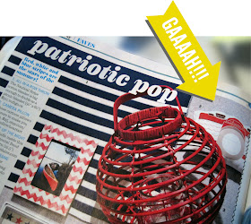
Back in March I got an email from Rachael Ray's posse. They wanted to potentially use one of my camera plushes in their July/August "4th of July Faves" issue of Every Day with Rachael Ray.

I was all like "I'm sorry-say whaaaat?"

They had contacted me Friday and wanted a physical product signed, sealed and delivered to them by Monday Morning.

crap.

All I can say is thank god I live on Long Island so overnighting my precious piece of cargo to NYC was at least possible. If that didn't work I was going to have to find someway to break the space-time continuum to get my stuff over to them, and to be honest I really suck at science so I really doubt that was going to happen. Plan B was going to be trying to stalk Marty McFly and see if he still had an in with the 'ol Doc-mastah.

I shipped off my swag and didn't hear anything for a few months, till the other day when this showed up in the mail from good 'ol RR herself.

oh, oh that? This is just Rache and I sitting on the beach drinking some-well-I dont know what "we're" drinking, its something red, and it looks awesome-let's go with malibu bay breezes?


 HOLY SHIZZNAT THERE IS MY CAMERA PLUSH IN ALL ITS 4th OF JULY GLORY.


I am so stinkin' STOKED YOU GUYS.

Now, do you remember this post I wrote a while back about "failures and accomplishments"? Where I said for every epic thing that happened to me I would also try to throw in there one completely sucky moment?

Well, no joke about a week later after Rachael Ray Magazine contacted me about my feature Ladies Home Journal had contacted me as well about featuring the same plush. I also had to overnight them a sample ASA to the P.

About 2 months later I got my plushes sent right back to me letting me know that they were not going to use them in their magazine.

womp womp.

I was so bummed out-I had gotten my hopes up only to have them come flying down.

But its ok b/c Rachael Ray though I was the shiz, take that Ladies Home Journal!

But seriously I need to thank all of YOU guys again. You are probably sick of hearing me say it but if it wasn't for all you guys re-tweeting one of my tweets or sharing on your blog my quirky products or posting my links on your facebook pages then no one would even know about Yellow Heart Art. I am a firm believer that if we all embrace other's accomplishments and shops that it will most definitely be returned right back to you.

Friday, June 8, 2012

Friday Faves the Renegade Edition!


Hey Guys! As you all know this blog has been pretty sparse in blog posts due to me gettin' ready for Renegade Craft Fair! 

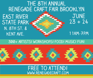
There will be about 300 vendors, if you're going to be in brooklyn June 23/24 come on over the Booth #59 and give me a "waddup" and a "holla". In case you are unsure who I am just look for the overly pasty girl with the horrible Long Island accent. See Also: Real Housewives of New Jersey or the Jersey Shore for said accent.

It's something of proud of guys, it just happened, ok?

ok, focus Leonora.

I wanted to do a friday faves dedicated to some of my favorite vendors going to this years Renegade! I am SO STOKED to finally get to meet the lovely ladies behind some of these shops. I am going to attempt to leave my military boyfriend in charge of my hippy booth for a hot sec while I frolic and spend money I don't have on things I clearly need from other vendors.

FRIDAY FAVES:

the greatest purses ever made by Made by Hank

um, yeah, these are HANDMADE PURSES. I know, I'm in shock too. Katie Henry makes modern looking purses that are not all foo-foo-girly-girly. The quality is un-freakin-believable. No joke you would think there were commercially made bags. Katie stole my heart way before I even had a shop on etsy myself. I adore her shop and love how it is super raw and original. You go girl.

Geometric Wonderness from Son of a Sailor

I think I love son of a sailor so much because just like made by hank their stuff is all simple, modern, and WITH IT. You don't see too many handmade products like this circulating out there. Made props guys.

Cutesy and Modern goodies from Homako

 so, check it, her stuff was actually sold in anthropologie! She also makes ORIGAMI NECKLACS out of FABRIC. Mind officially blown and exploded to bits.

link up with THIS GIRL

So I get all weird out when I tell people I'm going to be in a craft fair. I feel like craft fairs have gotten a bad rap. People don't associate them with frekkin awesome shizznat like all that stuff above. I pinky promise its cool to be in a fair--promise I'm still cool guys.

anyway, off to sew plush #490,564,056,090....eh, I lost count.